Ribbon chart
The ribbon chart is like a column chart with ribbons between the columns used to highlight changes in the relative ranking of categorical items. The item with the highest ranking will be displayed on top.
The chart has four field wells:
- Axis Columns to be placed on the horizontal axis. When using more than one column, you can drill down.
- Legend The categorical column used to color items.
- Values One or more numerical fields to be plotted; if you use a legend, you can use one field only.
- Tooltips Additional fields that users can see in the tooltip when they hover over a bar or column.
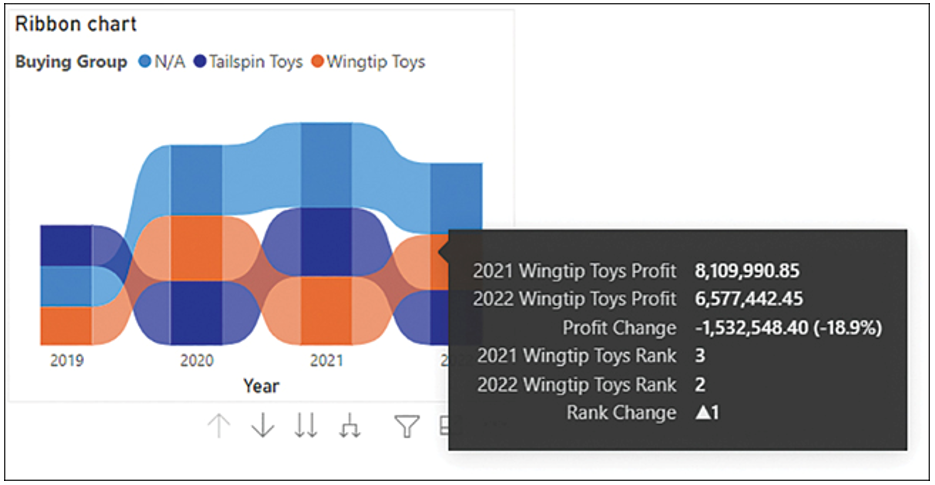
Tooltips in ribbon visuals will show additional information compared to the visuals we have covered thus far. When you hover over the ribbons between columns, you’ll see how the values changed between two columns. Figure 3-5 shows the ribbon chart and the tooltips when you hover over a ribbon.

FIGURE 3-5 Ribbon chart.
The ribbon chart is suitable when you want to show the progression of ranking changes between different categories across time.
Waterfall chart
The waterfall chart shows color-coded values in a running total fashion. By default, positive values are green and negative values red. This visual has four field wells:
- Category Columns to be placed on the horizontal axis, where each item is a stage. When using more than one column, you can drill down.
- Breakdown You can use one column here to show changes between categories.
- Values One numerical field to be plotted.
- Tooltips Additional fields that users can see in the tooltip when they hover over a bar or column.
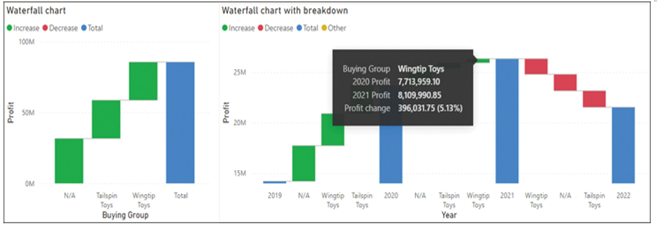
When you’re using the breakdown field well, hovering over a breakdown item will show the change between two categorical items. Figure 3-6 shows the waterfall chart and the tooltips when you hover over a breakdown item.

FIGURE 3-6 Waterfall charts.
Important Waterfall Total
Be aware that the total column in a waterfall chart is the sum of the categories in the visual, not the total that you would see without filtering the categories. This behavior is especially relevant with semi-additive or non-additive measures, such as balances or averages.
When you use the breakdown field well, only the top five items are shown by default, with the rest grouped into Other. The Other group is yellow by default because it may contain both Increase and Decrease items. You can change the colors, as well as the number of breakdown items, in the Format pane.
A waterfall chart is a good choice when you want to show what caused the most significant changes between time periods. The chart may also be appropriate to illustrate what the total amount is made of while showing the total at the same time for comparison.


