Pie and donut charts
The pie chart and the donut chart are the same except the latter has empty space in the middle. Both charts have the same four field wells:
- Legend For one or more categorical columns used to color items. When using more than one column, you can drill down.
- Details Each slice may be split by a categorical column used here.
- Values You may use one or more numerical fields here; if you show Details, you are limited to one field only.
- Tooltips Additional fields that users can see in the tooltip when they hover over a bar or column.
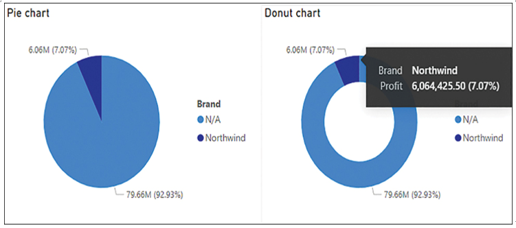
When hovering over a slice, you’ll see the proportion it makes up. You can see both pie and donut charts in Figure 3-9, with a tooltip showing for an item in the donut chart.

FIGURE 3-9 Pie and donut charts.
You can use either of these charts to show the relationships of parts to the whole. Both charts are not considered best practice in data visualization with one exception: you may use a pie or a donut chart when there are only two categories. Otherwise, if you are sure that users will not be comparing parts to each other, only to the whole, you may also use these charts. Be aware that having too many items in such a chart will make reading it difficult and take up a lot of real estate in your report. Using donut charts in addition to a card visual in the center of the donut may be helpful.
Treemap
The treemap chart can be thought of as rectangular pie chart because it also shows the relationship of parts to the whole. You can nest rectangles to further divide the whole. There are four field wells:
- Group For one or more categorical columns that will define the relative size of rectangles. When using more than one column, you can drill down.
- Details Each rectangle can be split by the categorical column used here.
- Values One or more numerical fields to be plotted; if you show Details, you are limited to one field only.
- Tooltips Additional fields that users can see in the tooltip when they hover over a bar or column.
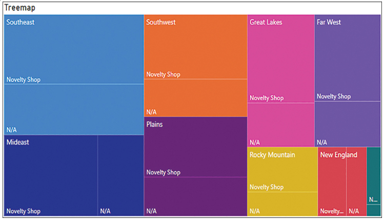
Unlike the pie and donut charts, the treemap chart does not show percentages in tooltips by default. You can see a treemap chart in Figure 3-10.

FIGURE 3-10 Treemap chart.
The rectangles in a treemap chart are arranged top to bottom and left to right based on numerical values in descending order.
A treemap visual can be a good choice when you want to show proportions between each part and the whole, as well as highlight the most important contributors and outliers.


