Line and area charts
Power BI has a line chart and two types of area charts:
- Line chart
- Area chart
- Stacked area chart
These charts have the following common field wells:
- Axis Columns to be placed on the horizontal axis. When using more than one column, users can drill down.
- Legend The categorical column used to color items.
- Values One or more numerical fields to be plotted; if the chart has a legend, you can use only one field for values.
- Tooltips Additional fields that users can see in the tooltip when they hover over a bar or column.
Area charts are similar to the line chart but have a shaded area under the lines. Additionally, the line and area charts have the Secondary values field well, which allows you to use a secondary y-axis if you’re not using the Legend field well.
The three visuals are shown in Figure 3-3.

FIGURE 3-3 Line and area charts.
Line and area charts are best used when you want to show historical trends or compare values across time. If you use a secondary y-axis, you should make it clear which line belongs to which axis by including axis titles to avoid confusion.
Combo charts
There are two combo charts in Power BI:
- Line and stacked column chart
- Line and clustered column chart
Both have the same five field wells:
- Shared axis Columns to be placed on the horizontal axis. When using more than one column, you can drill down.
- Column series Similar to a legend; one column may be used.
- Column values One or more numerical fields to be plotted; if you have a column series, you can use only one field.
- Line values One or more numerical fields to be plotted as lines.
- Tooltips Additional fields that users can see in the tooltip when they hover over a bar or column.
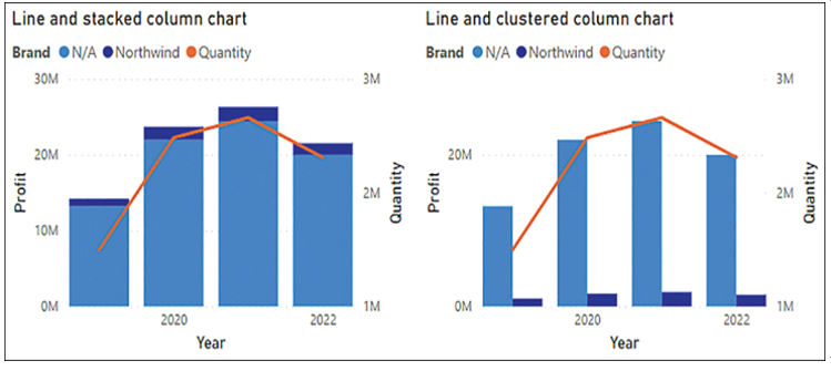
You can see both charts in Figure 3-4.

FIGURE 3-4 Combo charts.
Combo charts can be the appropriate choice when you plot two fields that have different value ranges and you want to use a legend for one of them. For instance, you could plot Profit and Quantity by Year, as shown in Figure 3-4.
By default, the column values appear on the right and the line values appear on the left. In the Format settings, you can switch the axes, as well as hide one or the other, which will align the axes.
Combo charts allow you to show line markers and set the line width to 0, which makes them suitable for comparing values across categories and time, and not only time.


