Funnel
The funnel chart is like a bar chart with bars centered, and it has three field wells:
- Group For one or more categorical columns, where each item is a stage. When using more than one column, you can drill down.
- Values One numerical field to be plotted.
- Tooltips Additional fields that users can see in the tooltip when they hover over a bar or column.
When you hover over a categorical item in a funnel chart, you see a tooltip with the proportion that category makes up of the first and previous items. It also shows the size of the last item relative to the first one. In Figure 3-7 you can see the funnel chart used with tooltips showing.
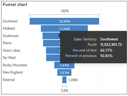
FIGURE 3-7 Funnel chart.
Because of this additional information in the tooltips, a funnel chart can be a proper choice for showing values by stages. This visual can also be used for revealing bottlenecks in a process or tracking workflow.
Scatter chart
The scatter chart can visualize two or more metrics for categorical items. Each item will be plotted according to the x- and y-coordinates, which will be taken from the metrics. When you use a third metric for size, the chart can be called a bubble chart. You can also create a dot plot by using a categorical column on the x-axis.
The visual has the following field wells:
- Details You can use one or more categorical columns in this field well to plot points. When using more than one column, you can drill down.
- Legend A categorical column used to color items.
- X-axis One field to be placed on the horizontal axis.
- Y-axis One numerical field to be placed on the vertical axis.
- Size For one numerical field to be used for relative bubble sizing.
- Play axis You can use a column here, which is usually a time-series column such as Year or Date.
- Tooltips Additional fields that users can see in the tooltip when they hover over a bar or column.
An example of a scatter chart is shown in Figure 3-8.
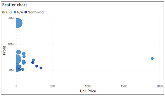
FIGURE 3-8 Scatter chart.
A scatter chart can be an effective way to show a relationship between two metrics or to highlight outliers.